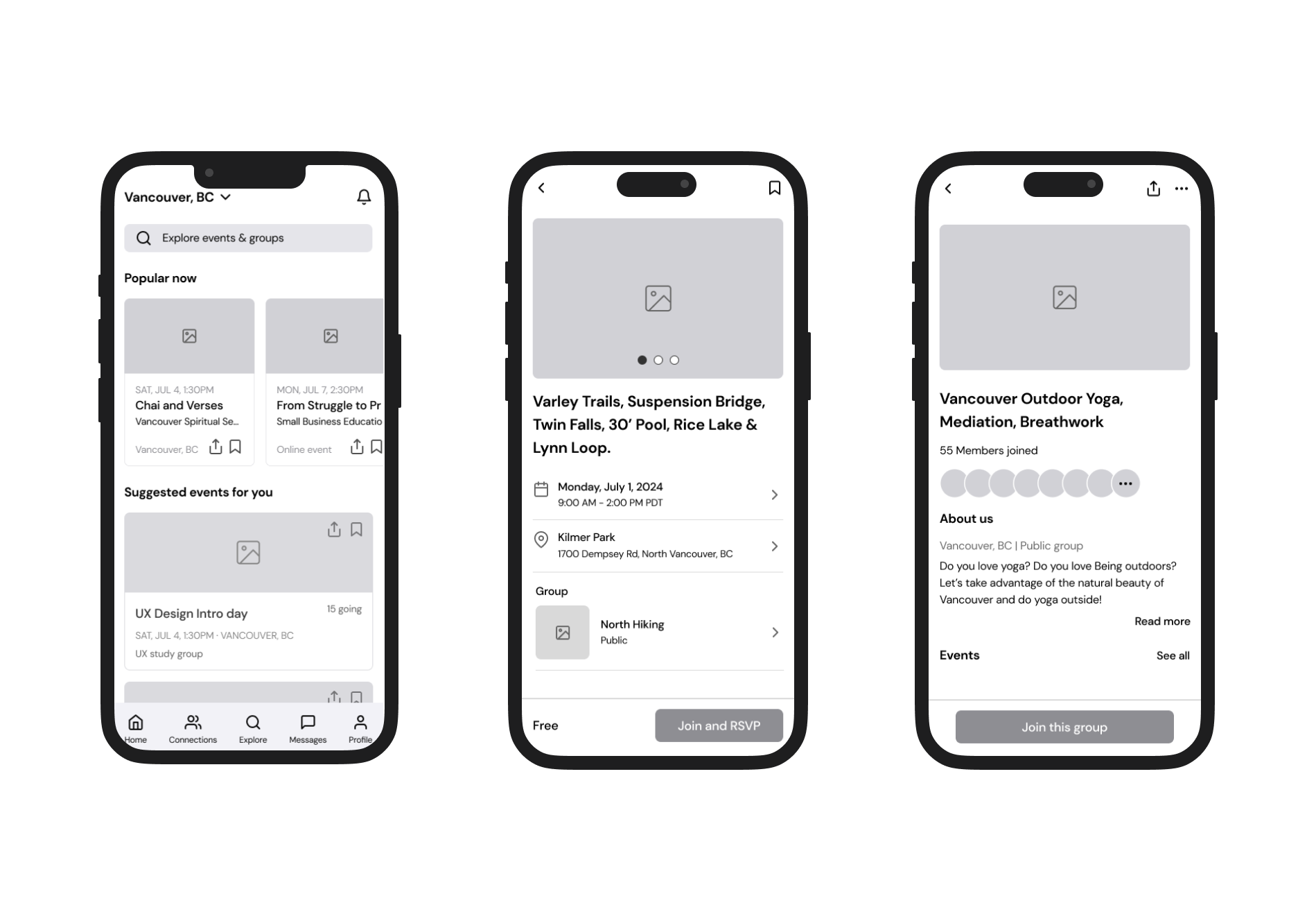


Meetup is a social networking app that facilitates offline group meetings in various localities around the world.

Meetup is a social networking app that facilitates offline group meetings in various localities around the world. Users can create or join groups based on shared interests, such as hobbies, career fields, or personal development goals. The app helps organize events, making it easier for people to connect and engage in activities they enjoy.
However, there are aspects that confuse users, particularly the ‘Explore’ and ‘Home’ pages. Additionally, accessing the ‘Profile’ page is challenging since it can only be found on the ‘Home’ and ‘Connection’ pages. The profile feature is important in this app because some events require updated profile photos to join, and events are suggested based on users' interests.
The goal of this case study is to solve these problems and redesign the UX to enhance user accessibility and reduce confusion. I also focused on fixing small details to improve the overall user experience.

The first page that appears right after logging in is the explore page. It shows a map, some events, and various categories. However, it shows the same categories of events to all users (Career & Business, Outdoors & Adventure, Learning, Health & Wellness, and Tech). This makes it feel like the app doesn’t consider users’ preferences. Since users set their interests and locations when they sign up, they might expect this page to show events related to their interests.
In addition, there is no button to access the profile page directly. Users have to go to either the home page or the connection page to get there.


Users can view suggested events by clicking the 'View Suggested Events' button. This feature shows events one by one, and users swipe left (don't save) or right (save) to see the next event on the list. Once users swipe left, they cannot go back and check that event again.
Additionally, in the calendar section, the 'All' list is confusing. Users might think it shows a combined list of 'Going,' 'Saved,' and 'Past' events. However, it actually displays events hosted by groups the user has joined, even if the user hasn't saved or joined those specific events.


The user might not know what this section is without a title.
If the user wants to join an event but finds that certain conditions such as time or location do not match, they would likely want to find similar events first.


Users need to scroll to the top to join the group. The row of profile icons is confusing because it appears there are no more pages to check additional members.
This circle and number are unclear in their meaning.
Even though it is not active, users would want to know what it is. Using blur makes it hard to figure out. And the readability of justified alignment is not very good.


Users can find the filter on the search result page.
Long category list with one column.


The numbers don’t have any function. They look like they will lead to related pages or sections.
The 'Add from 5k more' button doesn’t really have a function, and its text meaning is not clear. Additionally, in the 'About Me' and 'I'm Looking To' sections, the chip design might make users think they have already added their information.
Additionally, users can edit their profile by clicking those check icons. However, using these icons is confusing because they look like simple check marks.
